Let's Talk - Learning, Discussing, and Growing together

Tag: EDDL 5131

EDDL 5131 – Design a Student Media Project

Grade 7 Mystery Audiobook Project

Learning Outcomes:

  • Develop storytelling skills within the mystery genre.
  • Enhance creative writing and narrative structure.
  • Utilize digital tools (Soundtrap, Freesound) for multimedia production.
  • Collaborate effectively in small groups to produce an audiobook.
  • Demonstrate understanding of sound design and its role in storytelling.

Project Title:
Mystery Unraveled: A Grade 7 Audiobook Production

Purpose:
This project will challenge you to create an original short mystery story and bring it to life as an audiobook. Using Soundtrap for recording and editing, and Freesound for immersive sound effects, you will collaborate to produce a professional-quality mystery audio experience. Through this process, you will develop storytelling, digital literacy, and teamwork skills.

Final Deliverable:
Each group will submit a fully produced mystery audiobook (5-7 minutes in length) that includes:

  • A well-structured mystery story with clear plot development and resolution.
  • High-quality audio narration with distinct character voices.
  • Effective use of sound effects and background music to enhance mood and setting.

Process:

  1. Story Development: Brainstorm mystery ideas, outline the plot, and write the script.
  2. Pre-Production: Assign voice roles, plan sound effects, and set up recording spaces.
  3. Recording: Use Soundtrap to record dialogue and narration.
  4. Sound Design: Integrate sound effects and background music from Freesound.
  5. Editing: Use Soundtrap’s tools to mix and refine the final audiobook.
  6. Submission & Reflection: Submit the final audiobook and complete a short reflection on the creative and technical process.

Team Roles & Responsibilities:

  • Groups of 3-4 students.
  • Each student will contribute to at least two areas: writing, voice acting, sound design, or editing.
  • Teams will collaboratively review and refine their work before submission.
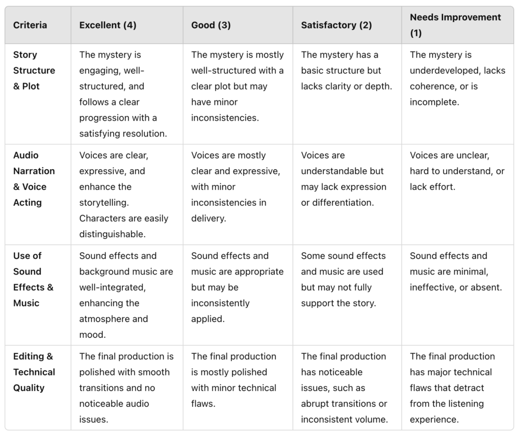
Rubric


EDDL 5131 – Alt Text

I have chosen to use the spooky house image that I sourced for an earlier example.

Title: spooky house

Photo by lynette@Morguefile.com

Alt Text: A dimly lit, abandoned house with peeling paint and broken windows stands eerily under the night sky, surrounded by overgrown grass and bare tree branches.

EDDL 5131 Try No Coffee

I was particularly eager to try the NoCoffee extension for two main reasons. First, I teach a course that covers visual disabilities, and this simulation provides an excellent way to demonstrate real-world examples to educational assistants. Second, I have recently started experiencing floaters in my vision, and the simulation helps convey to my family the challenges I face, giving them a clearer understanding of my visual difficulties.

For my test, I used the simulation on the website realtor.ca, which features house listings. On this site, users need to navigate through listings and read property overviews. Unfortunately, there are no accessibility features such as screen readers or text-to-speech options available. As a result, the site becomes largely inaccessible for users experiencing visual impairments such as macular degeneration, low acuity, ghosting, cataracts, or diabetic retinopathy, as the primary mode of interaction relies heavily on visual input.

However, for other visual impairments simulated by NoCoffee, users were able to move the viewing plane to access the information, allowing for some level of interaction despite the visual challenges.

https://www.realtor.ca/

EDDL 5131 Apply the WCAG Principles

As part of the Educational Assistant course I teach at RDP, we utilize an online resource where students complete free, short professional development sessions through the Alberta Mental Health Collaborative. This self-contained site is accessible to anyone and offers online certification in about an hour. I will be evaluating this resource against the WCAG principles of perceivability, operability, understandability, and robustness.

Perceivable – According to the Simply Said video, perceivability means users must be able to access information in ways that accommodate their unique needs (3:30). The course content is delivered through video format with closed captions, allowing multiple modalities for access. Additionally, clear instructions are provided for keyboard navigation.

Operable – The Simply Said video explains that being operable means users can navigate and interact with the content (3:47). The modules feature an interactive slideshow with straightforward navigation, allowing students to move forward or backward as needed, ensuring ease of use.

Understandable – The third guideline emphasizes understandability, meaning the content should be presented in a logical, clear manner (3:54). The material is structured in a coherent way that gradually builds towards comprehensive understanding.

Robust – Finally, robustness ensures the resource is compatible with a variety of devices (4:15). I tested the site on my phone, Apple laptop, Microsoft computer at work, and iPad, and it was accessible on all platforms.

Overall, I found this resource successfully meets all the WCAG guidelines for accessibility, making it a valuable tool for professional development.


Resources

Alberta Mental Health Collaborative. (2025). Recovery Alberta. https://ahsmore.mhcollab.ca/all-courses/

National Center on Accessible Educational Materials. (2015, March 3). Simply said: Understanding accessibility in digital learning materials. YouTube.

https://youtu.be/HzE5dj1WTSo

EDDL 5131 – Redesign the Moose

New formatted version Activity 2 – The Moose Revised

Addressing the Challenges of the Original Format

The original format of the Moose information was overloaded with dense text, which created difficulty for students trying to identify key facts and details. When there is too much information presented in long paragraphs, it can overwhelm students, making it harder for them to focus on the most important concepts. In my redesign, I broke the information into more manageable sections with clear headings and concise bios for each key topic. This allows students to quickly find and focus on specific details, such as the moose’s habitat, diet, and behavior.

Additionally, the inclusion of images enhances the overall understanding of the content. Visuals such as diagrams, maps, and photographs help to clarify abstract concepts that may be difficult to understand through text alone. 

Another major change I made was the addition of hyperlinks. These links lead to external resources or glossary definitions, allowing students to easily access supplementary information when they encounter terms or concepts they may not fully understand. This makes the content more accessible, especially for independent learners who may want to explore the topic in more depth.

Formatting, Navigation, and Readability

The layout of the material is an essential factor in making the content accessible and easy to navigate. I utilized the heading options in Google Docs because they help organize the material into a logical flow. Bolded headings draw attention to key sections, making it easier for students to scan through the content and find what they need quickly. This visual structure is especially helpful for students who may have difficulty with lengthy texts or need a more organized way to access information. By using a table of contents, students can jump to specific sections they are interested in, saving time and making the material feel less overwhelming.

I also chose a simple and high-contrast design for readability. The black font against a white background is clean and easy on the eyes, ensuring that all students, including those with visual impairments, can easily read the text. High-contrast color schemes like this are often recommended for educational materials as they reduce eye strain and improve comprehension. In addition, the blue-highlighted text for hyperlinks is a clear indicator to students that further information is available. It serves as a visual cue, guiding them to explore more about a specific topic when they need clarification.

Bullet points were used purposefully to streamline the information. Instead of long, complex sentences, the bullet points present key facts in short, digestible chunks. This helps students quickly identify and retain the most important details, without getting bogged down by unnecessary words. Additionally, the purposeful spacing between sections makes the content more approachable. By visually separating topics, it is easier for students to follow along and understand where one concept ends and another begins. This design choice is particularly helpful for students with ADHD or those who may struggle to maintain focus over long periods.

These changes, combined with the overall design, make the material not only more accessible but also more engaging. Students are able to focus on the content, explore additional resources, and retain the most important information without feeling overwhelmed or distracted.

EDDL 5131 – UDL

     I am an educator who firmly believes in and supports the use of Universal Design for Learning (UDL) in the classroom. One example of its implementation was in my Grade 7 in-person language arts class, which included 26 students with diverse learning needs. Among my students were individuals with visual impairments, various learning disabilities, and behavioral disorders. Given this complexity, it was crucial to intentionally design my classroom using UDL principles to enhance student engagement and learning.

     Key elements included offering students a choice in testing options, such as audio tests or oral responses instead of written ones. Additionally, I created different learning centers to cater to various preferences, including a quiet corner, a discussion area, a helper station, and a teacher station. I also integrated technology, providing access to digital tools like text-to-speech software and interactive reading apps to support different learning styles.

     To further support diverse learners, I incorporated multimedia resources, such as videos with closed captions and interactive storytelling tools, which helped make content more accessible. For my higher achieving students, I used technology to act as an editor as they worked independently on writing short stories for publication. In addition, I did not have a seating plan thus allowing students to choose where they felt most comfortable and promoting choice, and responsibility,  in their learning. Collaborative group work was encouraged, with roles assigned based on individual strengths, fostering peer support and engagement.

     Regular check-ins and formative assessments helped me tailor instruction to meet individual needs, while goal-setting activities empowered students to take ownership of their learning. By embracing UDL, I created a more inclusive and supportive learning environment, ensuring that every student had the opportunity to succeed and thrive.


EDDL 5131 – Measuring Accountability

My institution uses Blackboard as its LMS, which facilitates online education by centralizing course management, content delivery, communication, and assessment. Instructors can manage course materials, assignments, and feedback, while students gain easy access to resources, submissions, grades, and communication. Its integrated tools streamline teaching and learning, making it valuable for both in-person and online courses. However, the key question remains whether it meets accessibility guidelines.

  • Navigation is generally user-friendly, with keyboard navigation allowing users who cannot use a mouse to navigate easily, and information presented in a logical format. However, the extensive menu structure can make accessing course content time-consuming.
  • Content Structure benefits from consistent use of headings, titles, and lists across courses, with a uniform menu layout. The downside is the variability in how instructors organize content, which can confuse students navigating different courses.
  • Hyperlinks are clearly indicated by the universally recognized blue color, but the inconsistency in naming and usage, depending on the instructor, can hinder readability and usability.
  • Text is made accessible through the option for instructors to add alternative text to images and use color to highlight important information. However, this feature is underutilized, and the heavy reliance on text without frequent use of images can overwhelm students.
  • Images can be added to enhance content, but the process is not intuitive, leading most instructors to rely primarily on text, which reduces visual engagement.
  • Documents are supported in accessible formats, like PDFs and Word files, yet the effectiveness depends heavily on the instructor’s ability to upload materials correctly, which can lead to accessibility issues.
  • Multimedia capabilities include closed captions for videos and integration with YouTube, aiding users with hearing impairments. However, the incorporation of multimedia is highly dependent on individual instructors’ preferences.
  • Adaptability allows users to adjust color settings and use high-contrast modes for better visibility, but the process is not user-friendly, making it challenging for students to implement these adjustments.

Overall, while Blackboard provides a range of tools and features that enhance accessibility and usability, the effectiveness is often contingent on individual instructor implementation, which can lead to inconsistencies and potential accessibility challenges.